Sometimes you want your website to wow your visitors with eye-popping photographs and images. Especially for creative professionals such as photographers, illustrators, and writers, a photo-centric website is a fantastic way to display your portfolio.
With that in mind, below you will find a compilation of the best WordPress full screen themes currently available. While each theme has its own unique look and certain functions and features geared towards a specific niche, they all have several key features in common. These themes are fully responsive and look completely natural on a variety of platforms. Many of them include premium fonts, icons, plugins or widgets that would otherwise cost you extra to upgrade on their own. And all of them come from theme developers with stellar reputations for user-friendliness and support, so you’ll always have help if you need it.
Give these themes a look! We love them and hope you find one that’s a perfect fit for your business.
Werkstatt
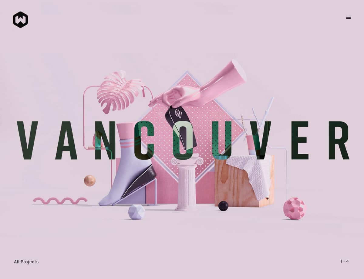
Werkstatt is a modern portfolio theme that is ideally suited to creative professionals or agencies. It offers a range of striking layout options, all perfect for showcasing imagery and designs.
With five full-screen templates to choose from, you’re ready to create an impact in whichever way suits you best. You can opt for a split screen, vertical slider, or parallax scrolling, or even try animated abstract segments to truly delight your viewer. Furthermore, Werkstatt comes with beautiful pre-built layouts for portfolio and blog pages. Customization features include seven grid layouts, over 3,000 fonts, and countless hover effects.
Werkstatt also offers full WooCommerce support and eight pre-built shop page templates. The theme is modern and chic, yet fun and playful. It has stunning full-screen options, along with plenty of flexibility to make it suitable for a range of applications. If you’re looking for a theme to create an incredible portfolio website that stands out from the crowd, Werkstatt could very well be the one for you.
Inspiro
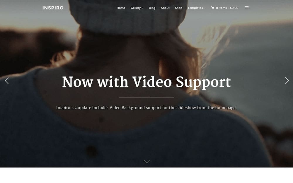
Inspiro is a truly stunning fullscreen WordPress theme, with lovely animation effects and a suave design.
The Inspiro design is a true work of art. It incorporates all the right colors and all the right typography, as well as just the right amount of white space for readers to have enough breathing room. Its gallery comes with a neat animation effect — when you hover your mouse over a gallery item, the image zooms in slightly, and text plus a call to action button show up on the image. You can scroll up and down the text, depending on its lengthiness, on the gallery item simply by moving your mouse up and down. The portfolio items have exactly the same animation, with a small addition that makes the items slide by left to right in an unbroken line.
Built to integrate well with WooCommerce, Inspiro is developed on the rock-solid ZOOM framework. It also boasts of a unique slider, custom widgets, and a widgetized home page. The powerful theme options include multiple color, ad, and SEO options.
Kinetika
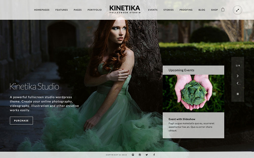
Kinetika is a striking, full screen photography theme that looks good from the top of its translucent menu to the bottom of its social-media integrated footer.
This is the kind of bold theme that lets a photo or video do most of the talking and puts an emphasis on images rather than text. Again and again, Kinetika users point to design quality as being the central hallmark of this theme. You can see that quality everywhere from the integrated Revolution Slider plugin to the combination event tracker / image gallery that can be easily embedded within your website. The binary light and dark display options are the epitome of simplicity and elegance.
Ideally suited for professional photographers, you can show off your portfolio with 11 different layouts, customize your homepage in over 40 different ways, and easily sell your work onsite. If you take pride in your artistry and want a dignified, beautiful online home to display your work, Kinetika’s elegant layout and translucence makes the perfect (digital) frame to show off.
Photography
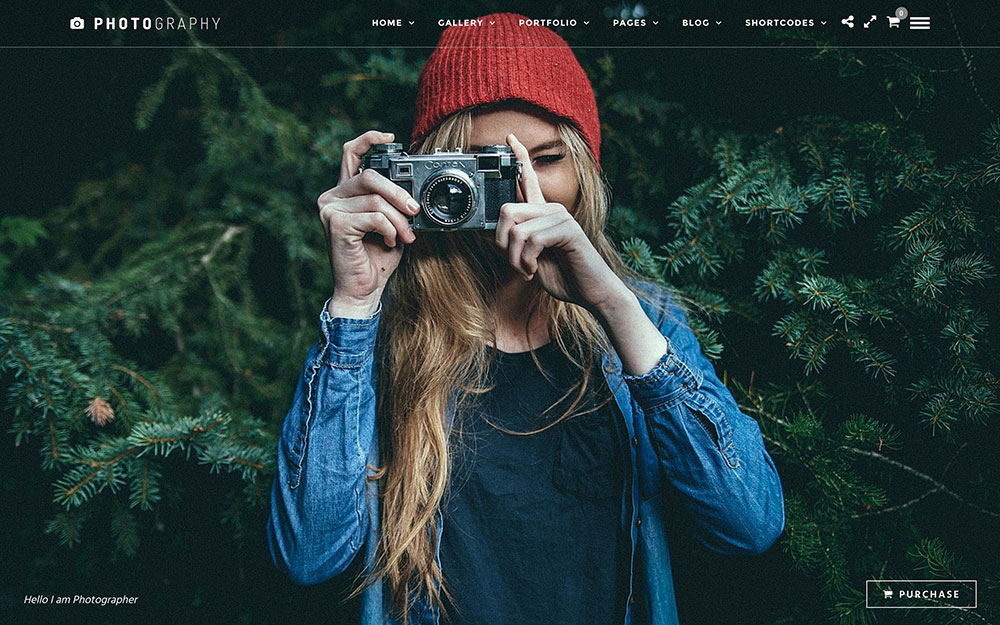
As the name of this theme makes plainly obvious, Photography was created with the goal of turning your portfolio into a stunning website worthy of sharing your best work with the world. Dozens of potential layout options including vertical menus, animated gallery grids, and full screen video make it easy to find the setup that suits your style and aesthetic preferences. Twenty-four demos and over 70 gallery, portfolio and blog templates that come standard with this theme gift you a smart and elegant display for your portfolio within minutes of getting started.
Certain unique benefits of Photography are especially suited for creative professionals. A photo and design proofing section lets you upload your content onto a password-protected section of the website, then invite your clients to access your shots or designs and approve or reject photos directly onsite. A beautiful infinite scrolling gallery option enables you to show off your best work to your site’s visitors with ease, and with e-commerce plugins already integrated into the theme, visitors can easily purchase single copies of your work.
This beautiful theme is ideal for photographers and other artists who aren’t just looking for a place to show off and sell their work, but would like to incorporate practical elements such as client photo proofing into their website as well.
Photo Me
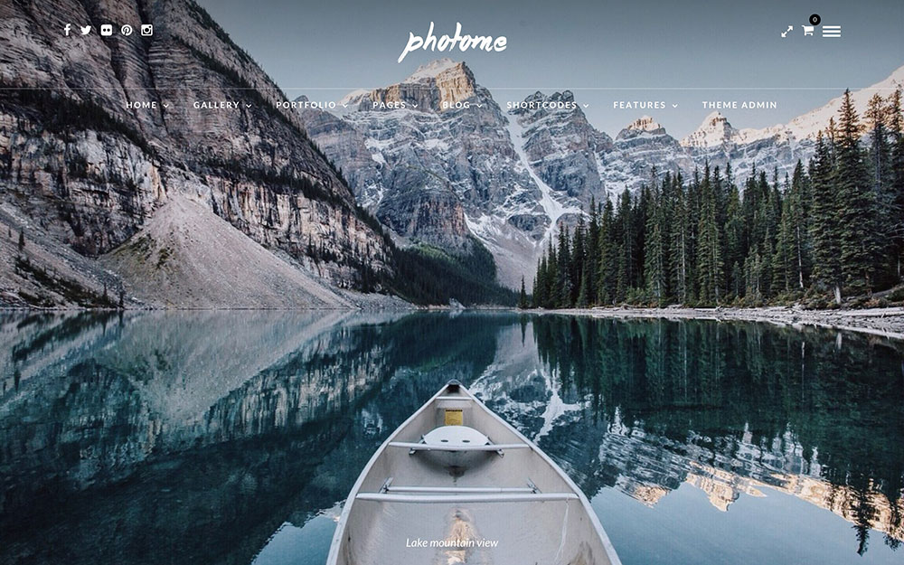
This sleek theme is highly customizable and perfect for photographers who want to exhibit their work on a website that is as impressive as the photos they exhibit on it.
Photo Me is worthy of the beautiful work you will display on it. Near-limitless color, icon and font options will give you the perfect look to match your style, and over 50 different gallery and portfolio templates ensure that there’s negative space in all the right places to complement your content. Eight separate gallery displays including as horizontal, parallax, Ken Burns, and split screen enable you to feature your photos in the manner that best suits your work. An intuitive menu setup provides for simple, elegant navigation tools that can be displayed vertically, in a pop-up sidebar, or straight on top of the page.
In other words, no matter how picky you are when it comes to showing off your oeuvre, Photo Me is so flexible – and so easy to use – that you’ll be able to build the perfect website to show off your photography.
Along with the usual bevy of high-quality plugins and shortcodes you expect from ThemeGoods, one of the more useful features of this theme is that it comes with password protected gallery access so that clients can access your work in the development stage and proof it as they see fit. This makes it an ideal theme choice for you if your work requires frequent input from clients, such as in fashion photography or interior design.
Kreativa
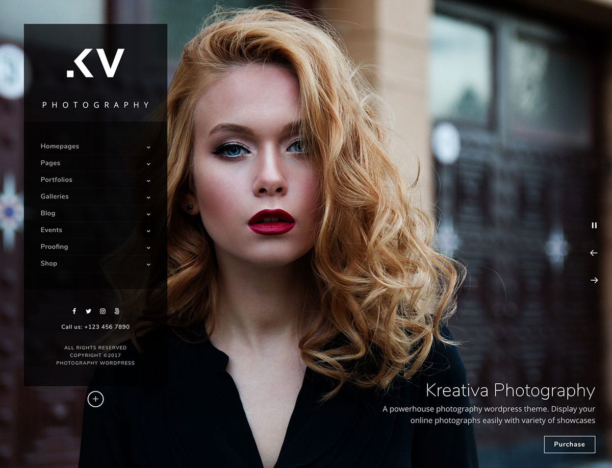
Photography and full-screen websites go hand in hand, primarily because this type of design maximizes your screen space. For a theme that feels like it uses every pixel to the fullest, check out Kreativa.
The first thing you’ll notice about this theme is the ample space for showcasing your images right on the home page. In fact, the default setup does away with any other elements, except for a stylish floating navigation bar. The small font size is tastefully applied, and allows your photography to be the main focal point.
There are 13 different home page layouts to choose from, and they all keep your images front and center. To enhance these designs further, you can choose from several attractive lightbox styles (among other options). Finally, there’s also a photo proofing feature, which enables your clients to preview work before they sign off a project.
In our opinion, Kreativa is theme that offers the best of both worlds. On the one hand, there’s plenty of flexibility and customization. At the same time, you’ll be safe in the knowledge that whatever changes you make will always be the right decision for your photography. This theme is one we recommend that you check out!
TwoFold
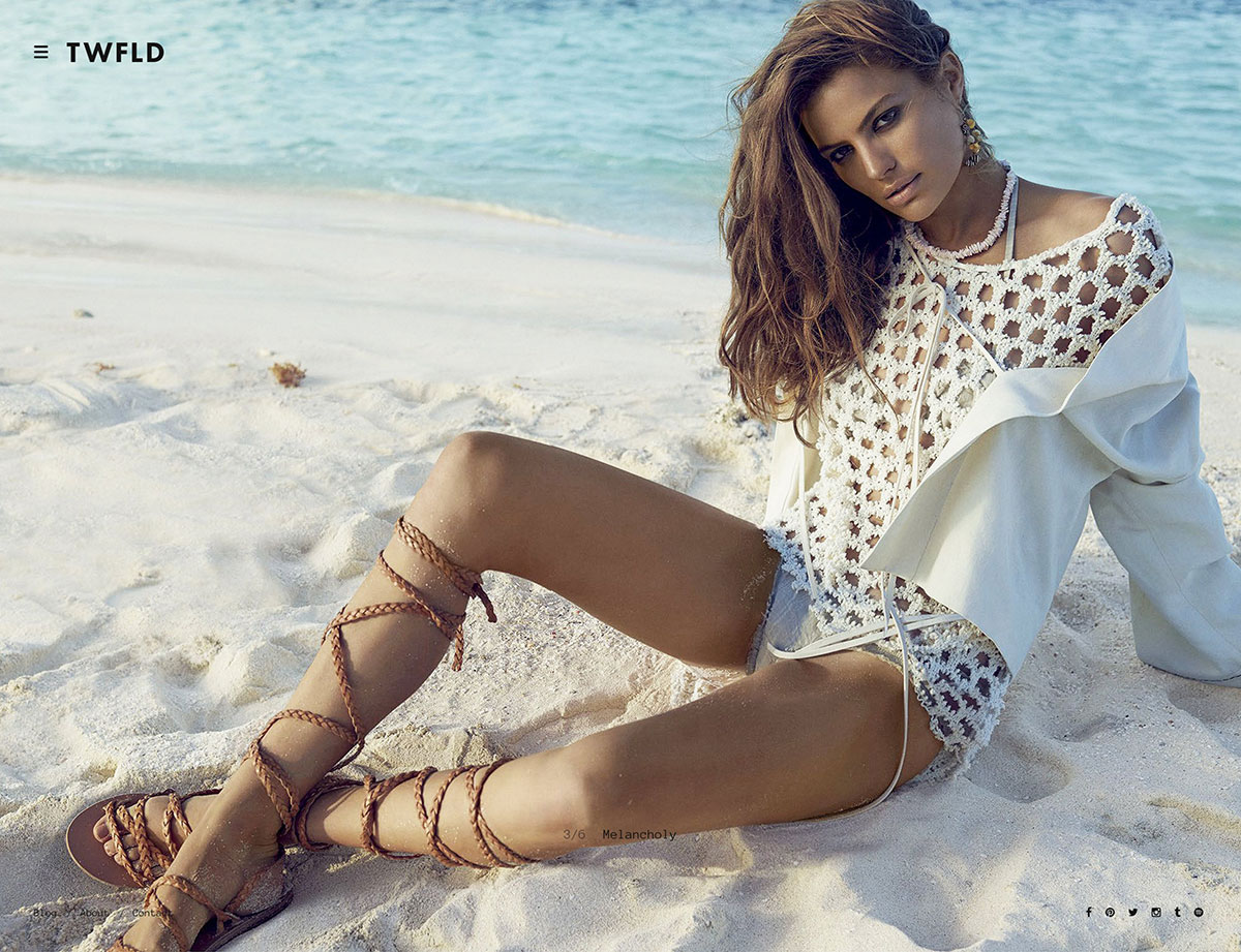
Some photographers produce work that can only be described as cutting edge, and work of that ilk shouldn’t be wrapped up in a boring or dated design. For photography at the forefront of current trends, you’ll need an equally modern theme – such as TwoFold.
Right off the bat, this theme looks effortlessly cool. There are a multitude of homepage layouts (utilizing stunning animations such as impressive ‘split screen’ and cube effects) that offer a totally unique way to scroll through your images. Even the Contact page looks amazing, with an embedded Google map displaying at full-screen – which on paper may not sound exciting, but is certainly in keeping with TwoFold’s novel approach.
Overall, with such an impressive set of animations to help showcase your images, TwoFold is a front runner if you’re looking to present yourself and your work a little bit differently.
TheGem
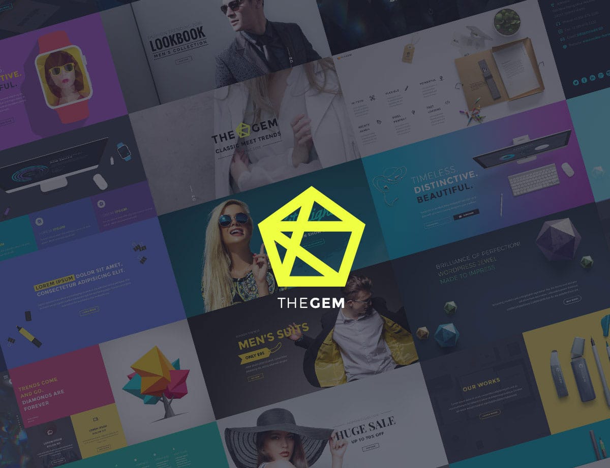
Full screen themes, such as TheGem, are arguably the most stunning examples of modern web design. Given the size of current displays, they have the ability to look almost widescreen.
A good full screen theme needs high-quality functionality. With this is mind, TheGem comes bundled with the Slider Revolution plugin. This enables you to create interactive hero screens that include video backgrounds and cutting-edge elements such as the impressive ‘particles’ animation.
As for the rest of your layout, TheGem offers over 150 demo templates to help you get up and running quickly. However, if you have a specific layout in mind, the bundled Visual Composer plugin can help you achieve almost any design.
TheGem is self-descriptive – it truly is a 24-carat theme. Whatever the application, it can help you produce a superlative website – and for that, it should go straight to the top of your shortlist.
Oshine
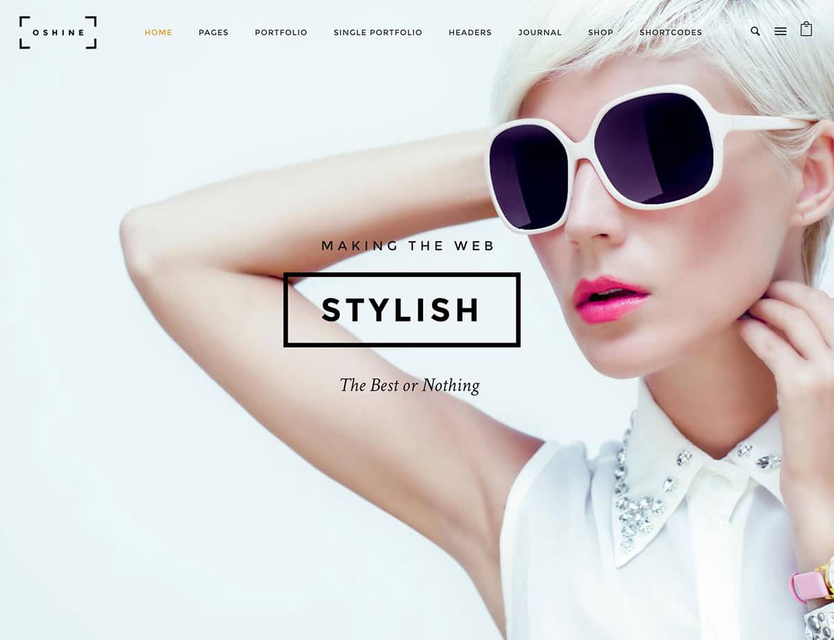
Stylish and classy websites need a design that matches their content. With this in mind, Oshine has quickly become a favorite among WordPress site owners, especially those who want as much space as a theme can possibly provide.
There are nearly 30 different home page templates available in this theme, and they all take advantage of the maximum amount of screen space. Oshine is mainly tailored towards photographers, although other creatives will be right at home, as will modern restaurants and agencies.
To help you actually build your pages, Oshine includes a live visual drag-and-drop page builder called Tatsu. There are pre-built sections included, so you can begin working straight away, although these are all editable to your exact requirements.
Overall, Oshine has a lot of flexibility and power, while focusing on doing one thing very well. If you’re a photographer or a similar type of creative, and you need to fill the entire dimensions of the screen with your content, Oshine is going to make you supremely happy!
Photogra
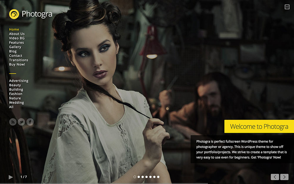
Photogra is another theme that includes navigation laid over a full screen image rather than having a navigation bar. One unique feature of this theme is the ability to have video backgrounds, which can make it an engaging visitor experience.
In addition to a responsive design, this theme also has three custom post types: portfolio, gallery and slider. The sliders have seven transition options and you also have multiple gallery options.
Photogra is equipped with an advanced admin so you can control the styling of your site. It also comes integrated with 500+ Google Fonts, which you can choose from a list. This theme is ideal for anyone who needs a portfolio that will showcase large images or videos full screen.
Bridge
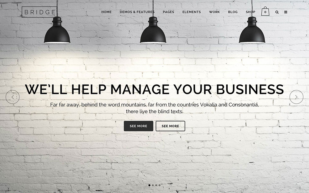
Bridge is a fully-loaded full screen website theme that looks gorgeous thanks to its flexible and powerful framework and tasteful design.
With more than 100 demos available, it is clear that Bridge can be adapted to whatever sort of business you own – photography, e-commerce, or otherwise. Using these rich demos as inspiration, you can construct your own website in minutes thanks to easily importable content and intelligently written shortcodes. The title area, menu, and header are fully customizable down to color, transparency, and font weight. Twenty-four different layout concepts, including ones designed to feature portfolios and other photography-centric elements, make the setup process as painless as possible. Just as important, the complex options available to you with Bridge are easy to command thanks to an intuitive and highly functional admin panel, so you waste less time troubleshooting with support.
A unique feature of this theme is its custom-designed slider, which features highly customizable and dynamic settings such as fade in/out elements animations and slide/fade transitions, along with various other settings which can be specified for each graphic, display text, and overlay pattern. Thanks to the endless customization options available plus seven different portfolio single layouts and seven different portfolio list layouts, Bridge is big and strong enough to function as a major e-commerce website, but nuanced and sophisticated enough to be a showcase for your creative work.
Darkroom
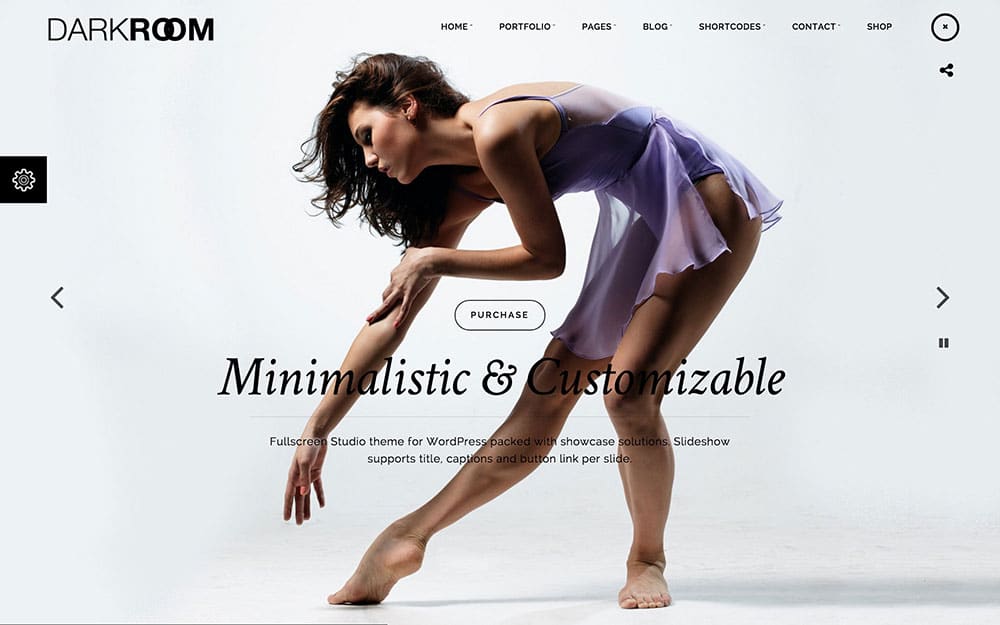
Darkroom is a beautiful minimal fullscreen theme.
Two color options, light and dark, are built into the header. Also included are 6 different fullscreen styles: slideshow, Kenburns, single image cover, YouTube video, Vimeo video, and Photowal. SEO optimized and multi-language ready, there’s nothing wrong with Darkroom from a coding front.
One of this theme’s more unique features is its ability to password protect portfolio items, photo galleries, posts, pages, and fullscreen posts. Hardly any other themes I’ve come across offer this security feature natively. 9 custom widgets — address, social icons, Flickr photostream, gallery, Twitter, related portfolio, recent posts, popular posts, and video, are built into the theme along with a visual shortcode generator.
Wizard
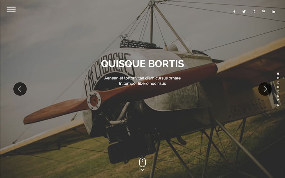
Wizard is a lightweight yet powerful full screen theme that is equally functional as a portfolio theme for your personal photography business as it is for your creative agency or small business.
This flexibility in terms of style and functionality is written all over the theme. Six different homepage styles are perfectly adaptable to your specific needs. Sliding image galleries can be embedded in each section to provide visual accentuation. Dark and light panels convey an understated elegance and unity in design from top to bottom. Dynamic text and optional auto-scrolling makes navigation across the website an intuitive and enjoyable experience.
Photography-specific features available on Wizard include highly adaptable portfolio grid displays where you can click on any image within the grid and enlarge it, and you can organize your portfolio into as many sections as you like based on the sort of work you do. You can also sort and categorize images by client, date, and link them to your shopping cart so customers can easily purchase them. If you are a professional photographer or other creative professional, you will appreciate Wizard’s modest elegance and its portfolio-first functionality.
Uncode
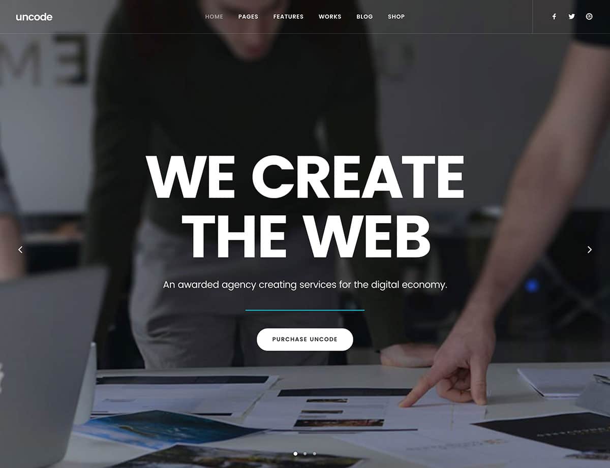
Many full screen themes cater to media-focused websites. That’s understandable, as these sites will often need to use all of the screen to showcase their content. However, many niches require more screen real estate – and for them, Uncode could fit the bill.
This theme includes a staggeringly large number of full-screen demo templates (branded as ‘concepts’) to choose from. They cover a wide variety of bases, and help you start creating your site quickly. Plus, they’re all customizable using a built-in version of the Visual Composer drag-and-drop page builder.
What’s more, Uncode includes an enhanced media library, including Spotify and Flickr content. This enables you to showcase your images, video, and audio, regardless of where it ‘lives’ on the web.
There is so much going on in Uncode that we’d need several books to explain it all. Our advice is to check out the demo and comprehensive documentation, and compare it to the competition. We think you’ll find it’s hard to beat!
Soho
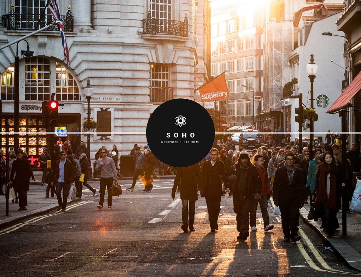
Captivating images often stoke the emotional fires within – but there’s little point in producing great work if your website can’t show it off to its fullest. Fortunately, the Soho theme is well up to the task, with a number of full-screen elements available to display your work.
Much like the now upmarket Soho area of London, this theme has a cool, modern look to it. The homepage has a number of layouts, including a stunning full-screen horizontal ‘striped’ navigation option (also used on the About page). You can also use a built-in full-screen slider, or a more conventional full-screen background image or video on your homepage.
Portfolio and gallery pages look gorgeous, with a myriad of options available to display your work, including a masonry layout, a Ken Burns option, and a ‘ribbon’ style that gives your images a Polaroid photo look.
Make no mistake – while the area of Soho has a reputation that precedes it, this theme is carving out its own path. Soho comes highly recommended for creatives looking to showcase their photography within a modern design.
Zyra
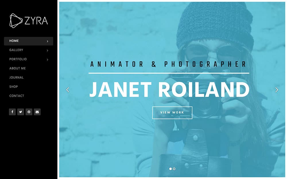
Zyra is a straightforward, no-nonsense full screen photography theme that is especially suited for you if this is your first time setting up a website.
The strength of this theme is that it keeps things simple. Photography and video support are included for easy uploading of your work, and the vertical menu option here makes it just as easy to create a navigation menu for your site as it is for visitors to browse it. Retina support makes it ideal for high-resolution photography display, the WooCommerce plugin is fully supported, ensuring that you can sell your work directly from the website, and multilingual options make this an ideal theme for you if you want a no-frills theme without the hassle of fancy extras you don’t have any intention of using.
Keres
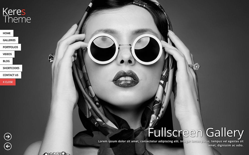
Keres is so packed with options, you’ll have a hard time deciding which layouts you like the best. Just the homepage alone features numerous layout options that range from a static image to a Ken Burns effect.
The animated navigation can be closed, so you can hide it and not interrupt the beauty of the images.The theme features audio support, and if you don’t like the multitude of options that come with the theme, you can create your own skins using the theme’s skin manager.
An additional differentiation with Keres is the ability to use unlimited sidebars. That allows you to create different sidebars for each page if you like.
Flora
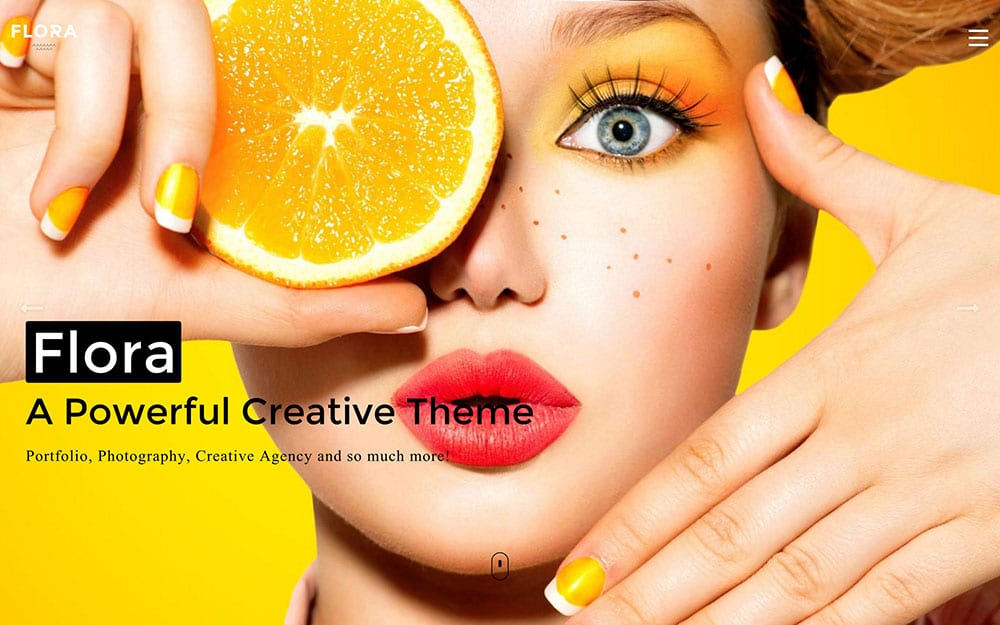
Flora is a bright, playful, creative theme that is ideally suited for photographers and creative agencies.
There are so many features to play with in this theme that you might have trouble figuring out where to begin! Lots of fun animations, including a Pacman-esque chomping one when you load the demo homepage, put a smile on your face before the theme has even fully loaded on your screen.
There are tons of unique elements to visually customize your website exactly the way you want it. Ten different heading types let you set the tone from the top. Vertical and horizontal tabs on menus can be interchanged with lots of charming icons. Info boxes can be grouped together in grids or laid out vertically, with as much or as little text as you prefer. Various animations can be used whenever you highlight, click, or hover over content.
For the creative types, you’ll especially love Flora’s minimalist portfolio option, which features a straightforward translucent top menu bar and an infinite scrolling portfolio set on a grid. Each project in the portfolio grid takes your visitors to a new page for that element, where you can give further details about the project, include meta tags for that project, explain what the client’s deliverables were, and include links to related portfolio projects.
Thanks to the many different customizable elements on offer, Flora is capable of being a top portfolio theme for photographers, illustrators, designers, and other creative professionals.
Burst
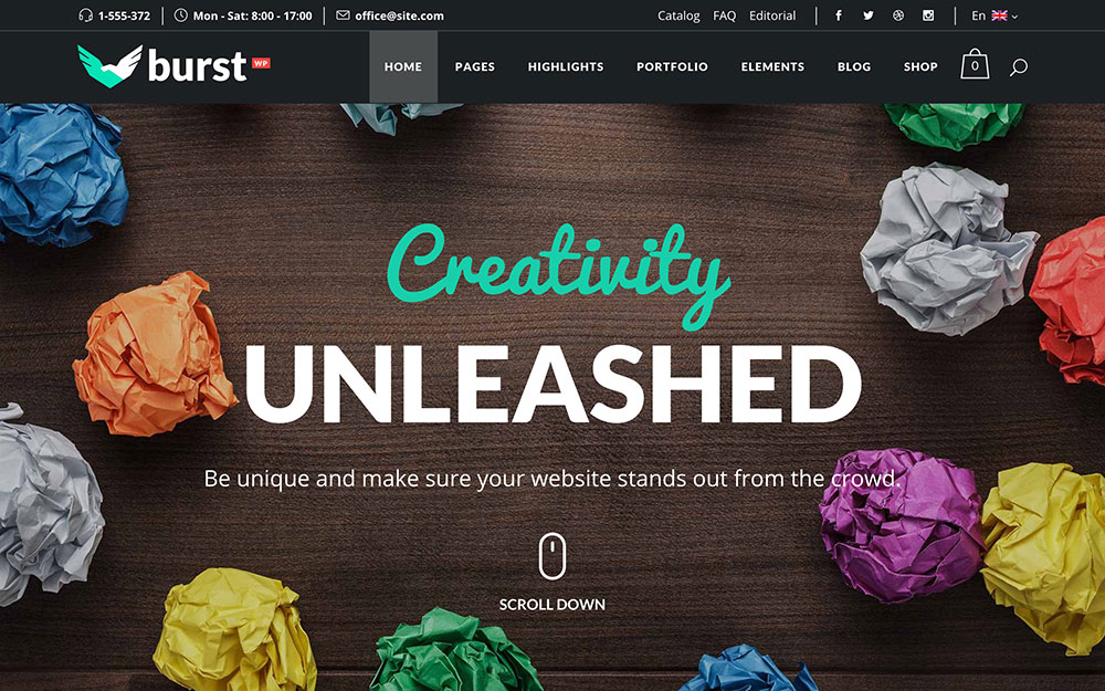
Burst is a bold and vibrant full screen theme that places the focus on bright colors, smart design, and stunning home pages.
This is a fun, colorful theme that relies on sleek animations, popping colors, and an array of smart layouts to give your website a bold, memorable look. Sixteen separate homepage demos provide you with a wealth of templates to create a beautiful website that is a showcase for your talent. Slick scrolling animations will keep your visitors’ eyes locked on the page, custom sidebars enable you to display menus, galleries or CTAs, while dark and light themes are accentuated with bright splashes of color.
Burst has a layout for just about any kind of niche. A simple grid setup makes it easy to show off your portfolio, a branding section is great for agencies and other businesses to leave a lasting impact on visitors, and integration with Google Maps makes it easy for customers to find your brick and mortar location.
Because of its color-forward style and bold, eccentric design, Burst is a great theme choice for creative professionals with similarly bright aesthetics in their work. If you are a fashion photographer or graphic designer this theme will greatly complement your portfolio with its bright vibe and edgy style.
Nietzsche
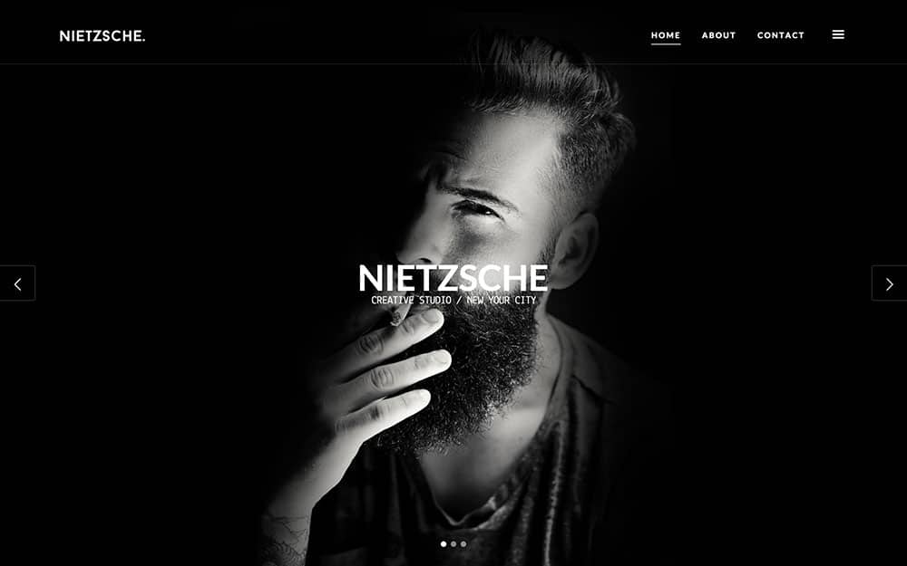
Nietzsche is a powerful full screen theme that enhances your content with minimalist design and eight in-house developed plugins to give your website an elegant yet understated look. It’s perfectly suited to showcase your portfolio or serve as a homepage for your creative agency.
With over 30 predesigned sections and more than 60 HTML templates, Nietzsche comes ready to use from the moment you download it. Everything from menu tabs to contact forms is completely customizable, and its solid custom-designed Timber framework ensures that the theme runs smoothly and effectively across multiple platforms.
Some of the more standout features available in this theme include four different headers and two footers, a creative blog index, a robust project grid system, retina support, and a touch-enabled lightbox. These features – especially when displaying high resolution photography, video, or other creative work – make it the perfect solution for creative professionals looking for an elegant and highly interactive theme.
Moose
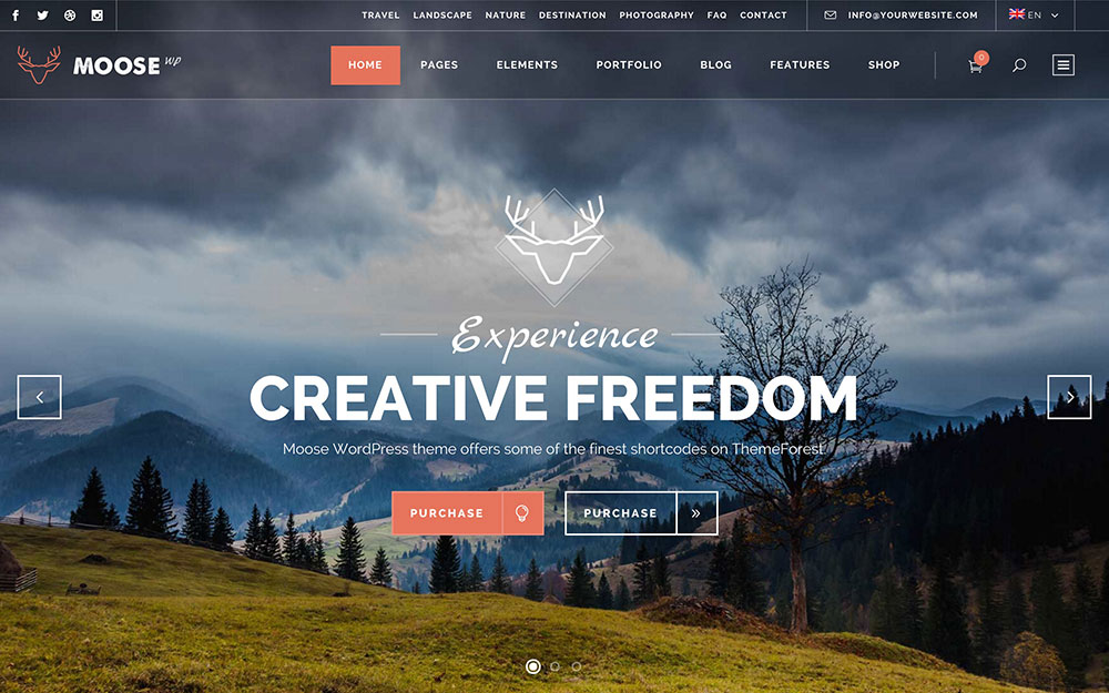
Moose is a beautiful, sophisticated theme that allows for practically limitless customization and looks especially great in full screen mode.
There are many different combinations of menu themes and layouts to get you started with Moose, and if you need a head start to get things going you can import one of ten demo themes and be up and ready to go in minutes. A variety of smartly designed homepage themes make it easy to find the right style for your niche, with special attention paid to the vastly customizable menu option.
A transparent header can go right across the top of your webpage and allow for more focus on the image front and center, or you can opt for a less subtle yet boldly designed side menu that features icons, with more information available when you hover your cursor over them. Other fantastic features of Moose include sleek CSS3 animations, crisp icon packs, and a variety of integrated premium plugins.
With so many possibilities for customization, whatever your niche is, Moose is a great theme choice. Its robust design and seamless visuals coupled with deep portfolio options including grid layouts, hover captions, and related project categories make it a beautiful place to show off creative work. But really, it could just as well make a fantastic theme for almost any type of business or website.
Sirius
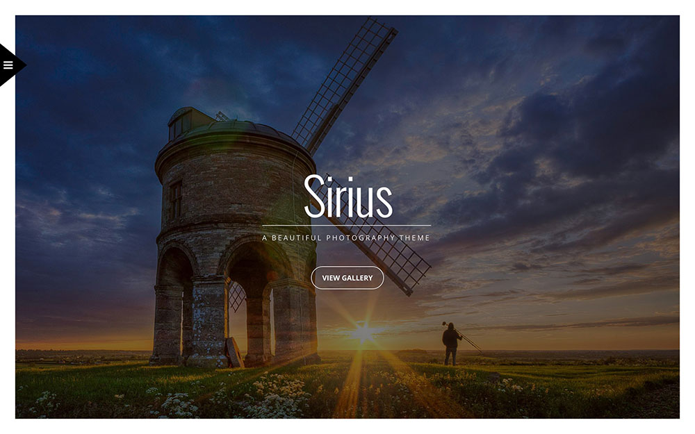
Sirius is an unusual, but quite exquisite, fullscreen WordPress theme.
The primary purpose of Sirius is to display images in a new and innovative fashion. The demo’s home page is just a slideshow of images that take up the entire space of the design. To view the menu, you have to click on an icon and wait for it to slide into view from the left. The other pages of the theme — such as the blog and portfolio pages — are designed in much the same manner, with the majority of the space being given to images.
Sirius comes with the ability to password protect your galleries and also the ability for people to comment on your gallery images. You can create a complex structure that spans over 6 columns. 14 gallery templates, translation-ready files, and an expandable and filterable portfolio are included.
Kappe
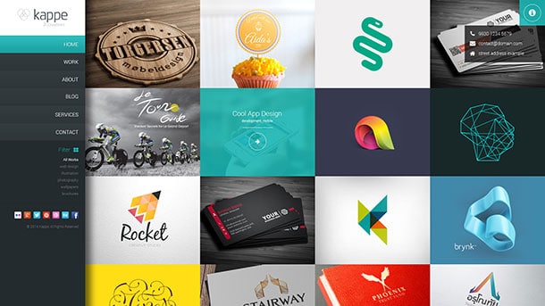
Kappe is a stylish fullscreen theme that has a lot in common with a previously discussed theme on this list, Wynn.
Like Wynn, Kappe comes with side menu navigation and a home page that’s entirely filled with tiles. These tiles however, instead of being the slides featured in Wynn, are tiles representing projects in your portfolio. It’s an interesting and attention-grabbing way to display your previous work to potential clients.
On the functionality front, Kappe is pretty lightweight with not too many capabilities built in. However, you do get Ajax pagination, a masonry blog layout, a shortcode generator, and 5 custom widgets. 300 Font Awesome icons and 500 Google Fonts are also available for use.
ePix
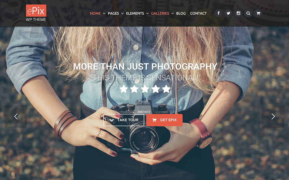
ePix is a versatile theme for photographers that allows for unlimited skins. You can change colors, fonts, layout, and it even allows for boxed or full-width content. It has a visual page builder and live customizer so you can tailor it to your unique needs.
Not only is it a full screen, responsive theme, it also has a parallax design and client login option with optional password. So if you have a photography business where you need to provide client logins to view portrait sittings or wedding photography, you have that option built in.
Since there are so many customization options, the developers have even provided thorough documentation and HD video tutorials to help you out. Some of the jQuery features include accordion, tab, vertical tab, and fancy box lightboxp. ePix comes ready for WooCommerce integration as well.
SmartScreen
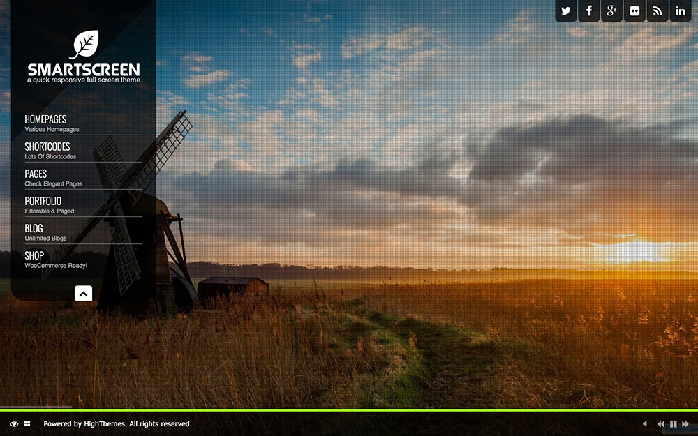
SmartScreen is a full screen, responsive theme that’s packed with a lot of features. It comes eCommerce and translation ready and has a customizable color palette.
The theme comes loaded with 20 transparent patterns that you can use over your background images to create a unique look. It has portfolio options that you can customize to display between one and four columns. There is a classic layout or a filterable layout. Some of the short code features are special boxes, pricing tables, button generator and accordion toggle.
The navigation loads as a vertical column on the left side of the screen, but it can be minimized. Some of the navigation and options such as the shop, social icons have a tab layout. On the pages and the blog layout you can choose to have a right sidebar or have the content the full width, which is actually just about two thirds because the first third is taken up by the navigation.
There’s functionality to toggle on or off audio for the site and there are audio controls for the user if they want to turn off the music or pause the slider. Overall, SmartScreen offers a unique layout and experience apart from what people have come to expect.
Accio
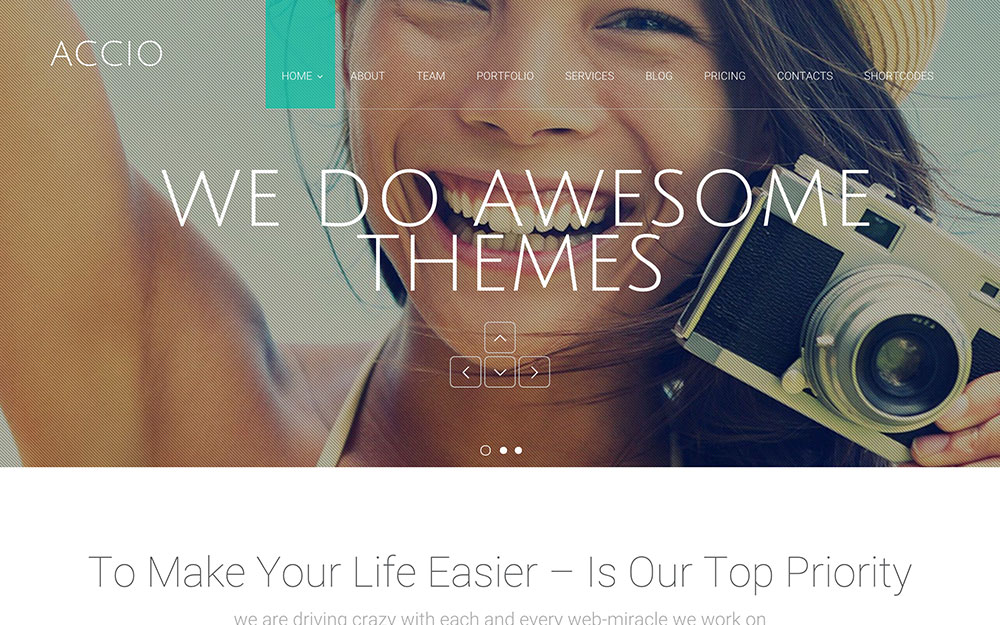
The first thing you notice about Accio is that it marries gorgeous full screen photography with dynamic text. It’s the kind of theme that balances beautiful images with a pragmatic yet innovative use of text.
Accio utilizes several sleek navigation plugins to deliver an exciting experience to visitors browsing your site. While its full screen capability makes it a great portfolio theme, Accio’s dynamic scrolling features make it a strong hybrid theme that can easily be adapted to corporate or sales websites. Smooth text animations, drag-and-drop layout construction, and unlimited slider and sidebar groups enable you to customize the site to your exact specifications. It would be easy, for example, to create a powerful copy-based or video landing page and then build up the rest of your website with the simple page constructing tool.
With such rich features beyond portfolio display options, it’s hard to say that this theme would be the perfect fit for a purely creative type of site. There are so many possibilities with a theme as dynamic as this, so if you have a creative business that requires more than just a portfolio or shopping cart, Accio would be a great choice for you.
Black Label
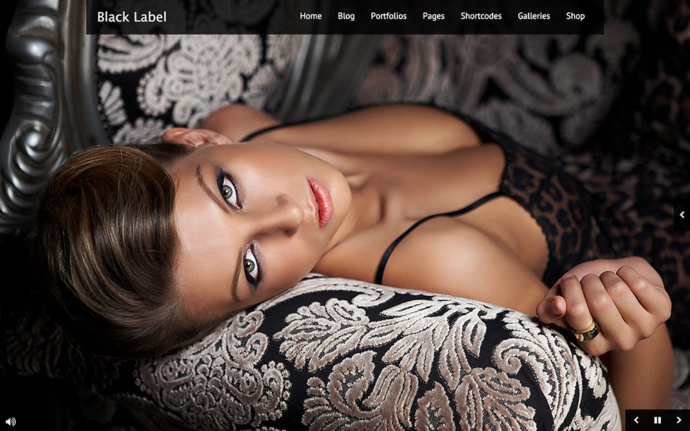
Black Label is a full screen, responsive design that comes with WooCommerce integration and lets you use full screen video and image backgrounds it lets you choose a light or dark theme skin. Overall layout options include slider, YouTube, or Vimeo video and HTML5.
One nice feature is the ability for users to pause the video and sound by clicking on the screen. Theme customizations include gallery options (both full screen and not), multiple portfolio types, and standard shortcodes such as tabs, contact forms, and lightbox photography.
Konzept
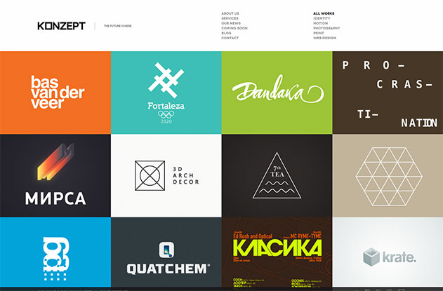
For creative professionals who are looking for a theme to showcase their work, Konzept is a solid minimal choice. The theme’s general styling is black and white except for image and video thumbnails, so it gives prominence to your portfolio work.
This theme has a number of layout and design combinations, so the theme developers have included several different demo page examples. This way you can see what the theme looks like featuring just project thumbnails, a project list, or a combination of slideshow thumbnails and list.
The most unique aspect of Konzept is its flexible input options. You can use the mouse, scroll wheel, track pad, touchscreen or keyboard to control navigation. This gives the user a smooth overall experience.
PhotoPharm
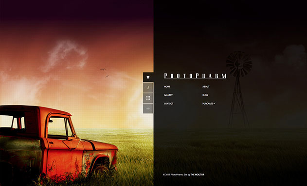
PhotoPharm is a truly unique photography portfolio theme. The main focus is really the photography, but when the site opens, the navigation is expanded which gives the screen a 50/50 split. Content is very minimal in this theme, where you really only have the info tab and then the blog which opens in the right half of the screen.
The rest of this theme is dedicated to image galleries that you can navigate and view from the menu. Left and right arrow key support lets viewers easily do from one image to the next. PhotoPharm comes with light and dark theme skin options and there is WP theme customizer support.
PhotoReactive
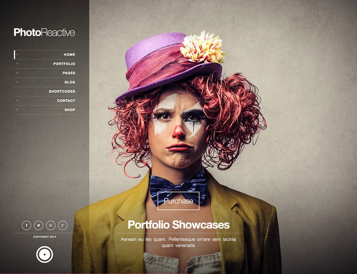
PhotoReactive is an unorthodox fullscreen theme with multiple innovative features.
To start with, PhotoReactive’s design comes with off-canvas navigation. The demo’s home page is nothing more than a large slideshow. Go into the portfolio and blog pages, and you’ll see a completely different style of design that has smaller, slimmer typography, a boxed content area, and multiple-column structure.
PhotoReactive is search engine optimized and translation-ready; it’s also stylized for WooCommerce and comes with different types of slideshows, video backgrounds, and portfolios. A long list of handy shortcodes and several custom widgets also feature in the theme.
Camilla
Photography that can tell a story is often the difference between good and great work, and a theme that can enhance the immersive nature of your images is vital. Step forward Camilla – a deceptively simple theme that offers a unique layout and design.
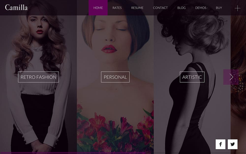
As Camilla is a full-screen photography theme, there’s little room for text – desirable if you’d like your work to take center stage. The homepage itself is essentially a flick book of your images, with the semi-transparent header keeping out of the limelight to increase the focus on your photography.
Navigating around Camilla is a unique experience. You can use either the on-screen arrow buttons or your computer’s trackpad to switch between pages, and while animations are a little jerky, it’s nonetheless impressive. The portfolio pages utilize a ‘striped’ horizontal navigation that certainly looks the business, and clicking each entry opens your work in a full-screen gallery, removing the header temporarily for maximum impact.
There’s plenty to love about Camilla – it’s a gorgeous full-screen theme that’s ideal for those looking to display their work uniquely, less any other unnecessary distractions.
Astro
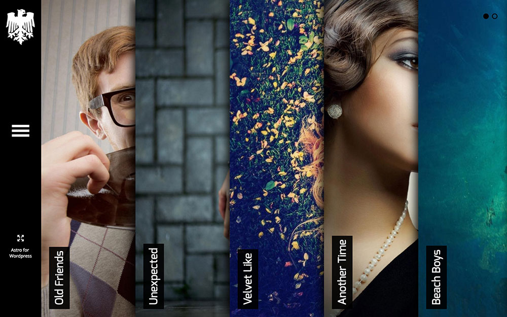
Astro has a unique vertical accordion homepage design that you can select to open and close. Clicking on one takes you to a mini gallery, which would work well for photographers and creatives.
The theme is responsive and has a collapsed navigation on the left side that you can open up as needed. Astro is pretty versatile and would work well as a portfolio or corporate site. There are a number of layout options that give the theme a different look entirely.
Lots of shortcode options give you all the design and functionality you could want. There are pricing tables, progress bars, service content blocks with icons, and more. All these features combine to let you feature a lot of content in a compact user experience, so it doesn’t feel overwhelming.
Division
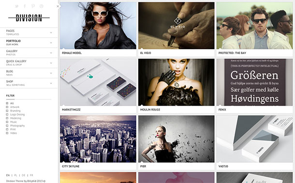
Division is another creative fullscreen theme that features side navigation and a photowall as its home page.
Division’s design relies on structure and high-res images to make it work. The side navigation has megamenu abilities, and the background of the design comes in different varieties (patterns, images, or simply solid swatches of color).
The theme is capable of a great deal of functions, including custom coloration and a plethora of typography options. The portfolio is both filterable and expandable. Coded with SEO and WPML-compatibility in mind, Division comes with 3 thumbnail sizes, 4 home page layouts, 4 thumb effects, 6 thumb overlays, and 4 thumb descriptions.
Right Now
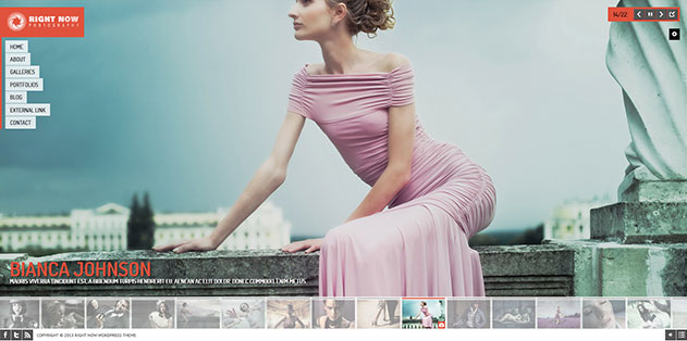
The Right Now theme feels a lot like a flash site with its navigation animation and mouse-over sounds. The theme allows you to upload more than 100 photos at once to create your galleries.
This theme has a lot of little surprises to discover, like the gallery at the bottom that can change the background and the audio player popup in the lower right corner. Right Now is equipped with YouTube, Vimeo, MP4 and MOV support. It even allows for drawing on the screen to navigate.
Vernissage
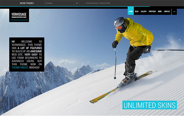
Vernissage is a modern theme that you can customize in a number of ways. It features 3 full screen slider options, unlimited skin styles, a flexible layout and easy gallery management. The theme’s 11 gallery types and 7 transition effects give you an opportunity to be creative with how you display your work. Additional theme options include the choice of a fixed or persistent header and content positioning that you can set to left, right or center.
For those looking to add ambiance to their site, Vernissage delivers with background music capability on posts, pages, projects and galleries. The theme’s navigation includes a simple play/pause button so users can have ultimate control of their experience.
Furies
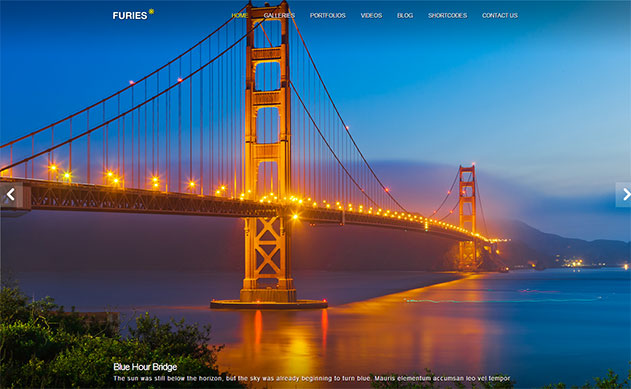
Furies is a great theme for those who want a photography portfolio that is a little more simple, clean, and understated. It has 11 gallery templates, full screen video background, music support and a skin manager.
You can set up the portfolio with two, three or four columns, with or without filter. Furies supports YouTube and Vimeo video and has blog templates that are full-width or have a sidebar.
Some of the shortcodes included with the theme are column styles, Google maps, buttons, block quotes, and more.

